Sunday, August 19, 2007

ClokUI (15/20)

This is the first request I have recieved to review a users UI, and I am pretty excited to do it. After reviewing some of Clok's screenshots, this looks like it could be a "No Bullshit UI", and by that I mean, the only things he has in the UI, are the things he needs. Clok also took the time to make a install movie just like SpartanUI which I had reviewed earlier. One of the main focus points on this UI seems to be optimization, with a 5.9mb RAR file, and a 20mb Full load with 0-7kb/s average, you can see Clok has taken some extra steps to cut down on the resources this UI uses. The UI is downloaded, my UI is backed up, and I have the install video ready to go, so lets get on with the review.


The Installation (4/5)
Ok, well not a very good start, I clicked play on the install video, and I get: "Could not download video file." Well, alright, it looks like we have to do it the old fashioned way. In the .rar are 3 folders, Fonts, Interface and WTF, after installing KerpUI a few weeks back, I know exactly what I need to do with these folders, so I go ahead and put all the AddOns into the Interface folder, and all of his Fonts into my WoW Fonts folder, as well as set up the WTF Account folder, by renaming all of his folders to my Account, Server and Character names. After that is all done, it is time for the first load of the UI, lets see how I did. First off, unlike SpartanUI, all of my personal Interface and Video settings were reset, to match Clok's game, such as my textures are at the worst setting. Other then that, the UI looks exactly the same as Clok's screen shots, so great job here.

Cleanliness (4/5)
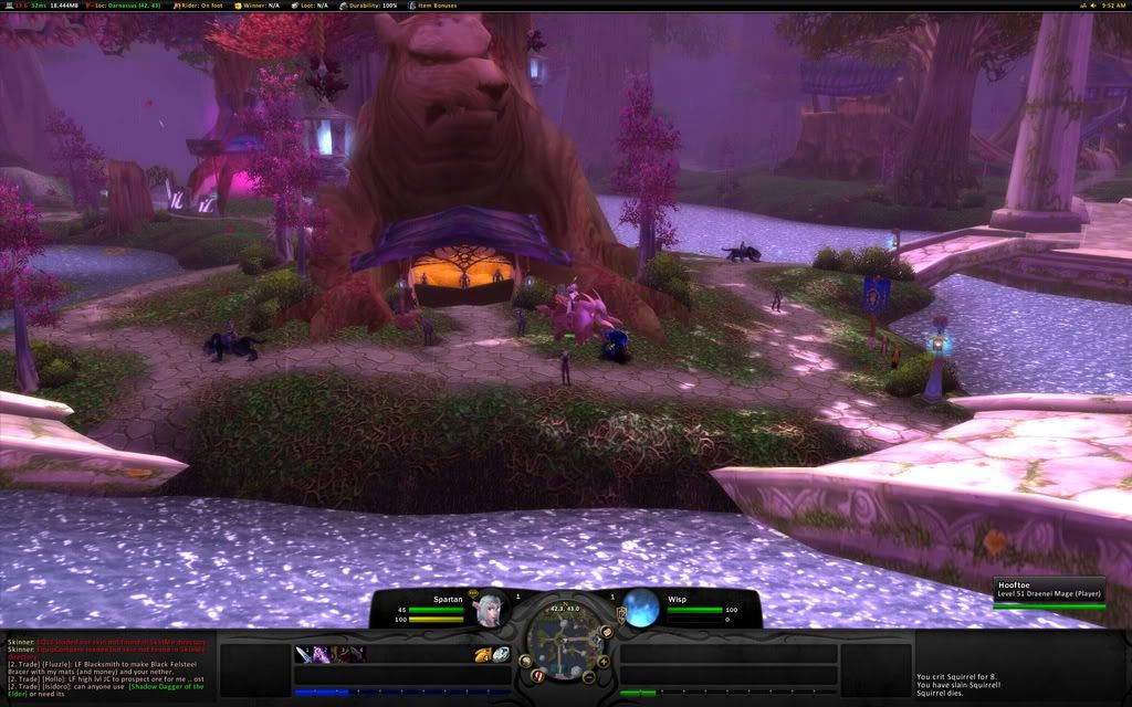
When you first look at the UI, you can tell, this is an extremely clean interface, I've said it before in other reviews, everything has a place, but this takes it one step further. Everything that is on the screen, can be used at some point while playing the game, there are no extra buttons to push or anything on the screen that is just eating up space and resources. Clok also took heed to those players still leveling their characters, as right above your health bar, you can see your experience, as well as an experience mod on the FuBar, placed right below the chatbox, as well as a mod that puts all your quests in the upper left hand corner for easy reference. All of the unitframe colors has the target as red, which can sometimes get confusing, especially when playing in a party or raid, or when targeting players of the opposing faction.

Ease of Use (3/5)
Apparently continunig with the trend of reviewing extremely small UI's I have found another. The action bar buttons, are no larger than 25 pixels in height, and crammed down into the bottom left corner, with only 23 buttons to place spells on. When I first went to attack a mob, I realized that I was in battle stance and did not have my charge spell on the bar, and after changing stances a few more times, I realized that the action bar does not have paging, therefore it would take some extra work to turn that on, and configure it. While configuring that, one may want to make the action bars a bit bigger, and possible add some more buttons. The chatbox was nice though, breaking each different category into its own different section, such as General, Guild/Party, Whispers and Reputation. The relocated tool tip may throw a few players off as well, but that is easily fixed, and can be customized to ones liking.

Resource Usage (4/5)
Even having so many mods, 176 including the blizzard add ons to be exact, this UI still runs extremely well, my total addon memory was around 16.2 MiB, and the current memory being used was at 24.2 MiB. Just a few mb over what was advertised, I would call this UI a win in the resource section. I was also running around with about 60 fps constant in Shadowprey Village, and my normal 30 fps constant in major cities such as Orgrimmar, so no real change to my FPS.


Summary (15/20)
Even though this is Clok's first release, and there are plently of things that can be improved upon, if you are looking to go minimalistic, I would offer this UI to you, everything is really small and no space is wasted, which is the main focal point of a minimalistic UI. Some people may want to change some of the UI, such as the unit frame health bar colors, and also make the action buttons a bit larger, as well as add some more buttons down there, but all in all, this is a quality UI, and can be perfect for a special niche of players.

Download ClokUI HERE.

Tuesday, August 14, 2007

Spartan UI (18/20)

About 6 months ago while looking for some UI Mods and Unitframe layouts for some ideas, I came across a screenshot of Ansu's Spartan UI, and was completely amazed. This was the first UI that I saw that changed my mind about the bottom panel completely covering up a portion of the screen, normally Im not a fan of 10% of my screen missing, but, after viewing the SpartanUI website www.spartanui.com, I was further impressed. Ansu, from the server Dalaran has really put some time into this UI, as here are jsut some of the features; completely redesigned user interface, low memory usage (6mb), customized auto-setup installer, and some free cookies. While the cookies are a joke, this UI is not, this one sounds like it could score the first 20/20, but after backing up my own UI, I am now ready to review SpartanUI.

The Installation (5/5)
When I first opened spartainui.com, I once again took a peek at the features, and knew I was in for a treat. I clicked on the download button, chose Curse-Gaming for the download location, and within seconds it was downloaded. On the website is the video section, where it shows how to install SpartanUI. Wait, a video? I guess this is 2007, readme.txt are so 2006. So I watched the video and followed it step by step, and everything went very smooth, just like the video, except for the fact that it was done on a mac (eewww...). Also, there was one more hitch, he was using a widescreen monitor for his game, and on my 1280x1024, I was unable to fit the chat boxes on the bar like he did, no big deal, and just a little common sense on how to fix it.

Cleanliness (5/5)
The nice thing about this install was that all my binds were saved, and all my resolution setttings and things of that nature stayed the same. With a few simple commands, the broken up UI was fixed into the UI that you would see from his screen shots section. SpartanUI is extremely clean and everything has a place. If you need to access a mod, just look on the top FuBar panel, and you will most likely find it there. One of the cool FuBar mods he had, was a option to change the sound settings, like turn music on and off, or turn the volume up and down, this would really come in handy for people like me who like to fidget with that stuff all the time. The seperate experience and reputation bars were a nice touch too.

Ease of Use (4/5)
The first thing that I noticed when I started to actually use this UI in game, was the fact that the unit frame health bars were extremely small. All the font on the unit frames too, were really small, such as the health text, and the mana text. Along with small unit frames, there are small action buttons to match. Being a clicker, it got somewhat frustrating trying to click each spell down there, especially with them being so little. I know the majority of the WoW community have binds for most of their spells, but also, there is a matching number of people that click their spells as well. If you choose to use this UI, you may want to find a different solution for the unit frames, such as a custom pitbull setup, but that may just be preference.

Resource Usage (4/5)
On the features, it says that SpartanUI only uses 6mb of resources, but when I had the mod on, it was showing 13mb of memory usage. No real big deal, but for some users who are trying to use as few mods as possible, this may not be the UI for you. Even though with all the mods in this UI, it did run surprisingly smooth, no real lag in major cities, and I kept the same frame rate as I did when I used the default blizzard UI.

Summary (18/20)
After two back to back awesome UIs, (KerpUI), the readers can now know what I am looking for in a UI. Even though neither of these scored perfect, and I'm not sure if any will, this UI was outstanding, the thing that really blew me away was the install video, very informative, and far more better than a simple readme.txt. But, as I said earlier in the review, this UI may not be for newer members to the game, as most of the mods on the screen are extremely small, this UI requires a pretty good knowledge of the game. So, if you are looking for something to replace the default blizzard interface, you have found the UI to do it.

Download SpartanUI HERE.

Monday, August 13, 2007

How to Get Your Interface Reviewed

There are 2 ways to get your UI reviewed by me. You can first off, reply with a comment in this post, in the following format:

Your UI Name
Your WoW Alias
Your WoW Server
Download Location
Screenshot 1
Screenshot 2 (optional)
Screenshot 3 (optional)

See the first comment for an example on how I want your comment to look like.

If I do decide to review your UI, I will contact you through WoW, and get any additional information that I may need. After it is reviewed, I will post it on the website and let you comment, as well as anyone else who may want to.

Monday, August 6, 2007

Kerp UI (16/20)

Even though I was referred to Kerp UI from my post on the World of Warcraft UI forums, it was not my first time to see Kerp UI in action. When my guild was learning Lady Vashj, I downloaded a movie of a guild killing Vashj, and found an awesome UI, which ended up being Kerp UI. I then took some ideas and some of the mods from Kerp's interface and used it in my own UI, which I may review at a later date. But for now, lets get on with the review.
Please review my grading system here

The Installation (2/5)
Upon downloading KerpUI, which is a .rar, you are confronted with the following 5 folders; AddOns, Fonts, WTF for 1152x864 and WTF for 1280x1024, as well as a readme.txt. So the first file I opened up was obviously readme.txt, thinking that it would at least guide me through the install of the UI. I was wrong, the only thing inside the readme was a message saying, if you have any questions, please see my forum post, with a link to said forum post. So I went to the forum post thinking at least there it would tell me where these files needed to go. Wrong again, I was left to fend for myself. So, using many mods in my days of WoW, I know where these folders go, the AddOns folder goes to C:\World of Warcraft\Interface\, and the Fonts folder goes to C:\World of Warcraft\. But the tricky part was the WTF folder. Im using 1280x1024 resolution, so I slammed into the hierarchy of the 1280x1024 folder to find the character folder, which was "Kerp", I copied all the contents, opened to "C:\World of Warcraft\WTF\MY ACCOUNT\MY SERVER\MY CHARACER\" and pasted all the saved variables in there, then I launched the game. On my first launch what I got was what you see in the screenshot on the left. I was a little distraught, as the UI did not look ANYTHING like the screenshot. So I played with it for a bit trying to get it to look like the screenshot, but remembered, there were some more saved variables for the server and for the account. Thinking those variables might be needed, I exited the game, and deleted my entire WTF folder, copied Kerps whole 1280x1024 WTF folder, and renamed the Account, Server and Character folders respectivly, and then launched the game again. And I was greeted with a UI that looked EXACTLY like Kerps, see my screenshot on the right.

Cleanliness (5/5)
After getting all my binds recreated and all my WoW options (Music off, Auto Target for Bandaging, Mouse Sensitivity, etc.) the way that I like, I was ready to rock and roll. The UI is extremely clean, and there is nothing really on the UI that you don’t need, even when it comes to raiding. The default UI install had damage meters and a threat meter on it, but since I am testing it using my lowbie warrior alt, I removed those from the screen, to save some space. Nine times out of Ten, I will hate on someones UI if they have one of those huge bars at the bottom that completely covers up the screen. But in the case of this UI, it fits it perfectly, and it is very unobtrusive. One of the things I really liked was the Potion/Food/Hearth/Bandage Auto Bar right above the action bar, even though, on all the UI's that I have made, I have put that kind of bar floating right next to my character on the screen, but in this case I can get used to it.

Ease of Use (4/5)
To start this off, I will say that I have never heard of the mod, Duece Commander, and from now on, I will suggest it to all who make custom UI's. What it does is it sums up all your custom mods into one action button on Fubar, so instead of having 12 different Mods across your Fubar or on your minimap, Duece Commander puts them all into one single, easy to access bar. This is a really big plus for this kind of UI where someone may want to change a bunch of things, but not know where any of the mods are. Well look no further. The only thing I would give a negative on this category would be that everything was extremely small on my screen. I have a 19" monitor, and all the text and all the action buttons were really small.

Resource Usage (5/5)
According to my Memory usage before I installed KerpUI and after, there was no real big difference. I have 2 Gigs of memory, and the game was as smooth after installing the UI as it was before having KerpUI. The only problem was the first load, where it loaded all the addons for the first time, it took maybe an extra 10 seconds, but every load after that was fine. I even maintained my normal 40+ FPS in cities, and 60+ FPS outside in the wilderness by myself.

Summary (16/20)
All in all, I would say that Kerp has put together a really awesome package. For many users who don’t like to, or cant put together their own custom UI, this is a definate solution. Even though the install was a little tricky, I eventually figured it out, but for some new player who wants a custom UI, he will be completely lost, and will be going to go post on Kerp's forum, asking a question that has probably already been answered 50 times, which could have been fixed with a semi-detailed readme.txt. I will absolutely recommend this UI to anyone looking for a good, small and easy to maintain UI for raiding, but for the average WoW player, I think it has a bit too much.

You may download KerpUI HERE.

The Grading System

Each UI will get a grade, from 0 to 20, with 20 being the highest grade that a UI can get. To get to that grade, each UI, from the point of being downloaded is tested, on four different criteria, starting with:

"EASE OF INSTALLATION"
Contrary to popular belief, not all UIs come in a neat package for the average joe user to install. Some UIs have mods all over the place, and it can take just a few extractions too many for some users to become frustrated and not know where things go. On my first UI that I released, I had all my folders in one .zip file, with no instructions. Within hours I was getting bombarded with emails and instant messages with questions on how to install my UI. Solution: readme.txt. This seemed to answer most of their questions. All I did was tell people where to unzip the files, and they were golden that point on. On some other UIs I have downloaded, I noticed some nifty install instructions, to make your screen look exactly like the screenshot they provided. And on the other hand, I've downloaded some really nice UIs, only to install them and have it look awful and nothing like their screenshot, simply because they did not tell me how to install it. So, what I am looking for here is a simple readme.txt of sorts for minimal points, or if you go above and beyond and make my screen look exactly like the makers screen, you get a 5/5 here.

"CLEANLINESS"
After the UI is installed, and ready to go, how does it look? The UI looks exactly like the screenshot, so now, are there things all over the screen blocking the view of the game? Is there a bar at the top and bottom of the screen that covers up 50% of the viewable area? Are the unit frames so large that I cannot even see my own character nor my target? These are just some of the characteristics I will be looking for when I am using the interface. Remember, I am not only looking for "minimalistic" UIs here, I am looking to make sure that the UI is not "ugly" with badly rendered textures and or mismatching colors, just make the UI "clean!"

"EASE OF USE"
This category can fall upon many different criteria, but to sum it up, I would summarize it as, how easy it is to use and or change something in the UI. If I want to make that unit frame smaller, do I have to go through a whole slew of options to change it, or can it be done really fast and easy? If I want to add another action bar to the UI, do I have to type 50 different commands to get one to come up? I know most of this category is based on the mods themselves, but a UI is only as good as the mods that are chosen.

"RESOURCE USAGE"
During high play times in cities, or during a raid or a dungeon, how many resources is the UI using? Obviously the lower the resource usage, the better, but if a UI has 50 mods and it makes the game unplayable, then it will get a pretty bad score. Depending on the number of mods, the score for this category can change quite a bit, but once again, this category is coming down to the mods used.

Saturday, August 4, 2007

First post

Hello all, this is the inaugural post for WoW UI Reviews. I have made a post on the WoW.com UI Forums asking for UI's to review. Hopefully I can get some feedback, so I can begin to review some interfaces for you guys.

Any other thoughts and or ideas can be commented here in the meantime. Also, this website is only temporary, until I can get the WoWUIReviews.com domain registered.

Thanks!
Ryan