
 About 6 months ago while looking for some UI Mods and Unitframe layouts for some ideas, I came across a screenshot of Ansu's Spartan UI, and was completely amazed. This was the first UI that I saw that changed my mind about the bottom panel completely covering up a portion of the screen, normally Im not a fan of 10% of my screen missing, but, after viewing the SpartanUI website www.spartanui.com, I was further impressed. Ansu, from the server Dalaran has really put some time into this UI, as here are jsut some of the features; completely redesigned user interface, low memory usage (6mb), customized auto-setup installer, and some free cookies. While the cookies are a joke, this UI is not, this one sounds like it could score the first 20/20, but after backing up my own UI, I am now ready to review SpartanUI.
The Installation (5/5)
When I first opened spartainui.com, I once again took a peek at the features, and knew I was in for a treat. I
 clicked on the download button, chose Curse-Gaming for the download location, and within seconds it was downloaded. On the website is the video section, where it shows how to install SpartanUI. Wait, a video? I guess this is 2007, readme.txt are so 2006. So I watched the video and followed it step by step, and everything went very smooth, just like the video, except for the fact that it was done on a mac (eewww...). Also, there was one more hitch, he was using a widescreen monitor for his game, and on my 1280x1024, I was unable to fit the chat boxes on the bar like he did, no big deal, and just a little common sense on how to fix it.
Cleanliness (5/5)
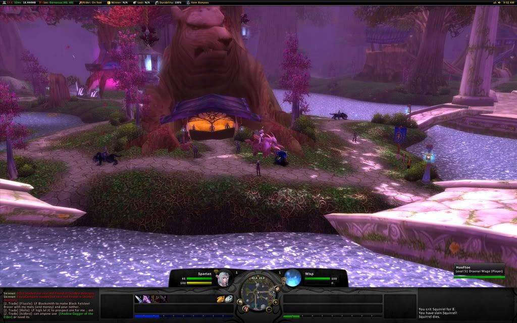
The nice thing about this install was that all my binds were saved, and all my resolution setttings and things of that nature stayed the same. With a few simple commands, the broken up UI was fixed into the UI that you would see from his screen shots section. SpartanUI is extremely clean and everything has a place. If you need to access a mod, just look on the top FuBar
 panel, and you will most likely find it there. One of the cool FuBar mods he had, was a option to change the sound settings, like turn music on and off, or turn the volume up and down, this would really come in handy for people like me who like to fidget with that stuff all the time. The seperate experience and reputation bars were a nice touch too.
Ease of Use (4/5)
 The first thing that I noticed when I started to actually use this UI in game, was the fact that the unit frame health bars were extremely small. All the font on the unit frames too, were really small, such as the health text, and the mana text. Along with small unit frames, there are small action buttons to match. Being a clicker, it got somewhat frustrating trying to click each spell down there, especially with them being so little. I know the majority of the WoW community have binds for most of their spells, but also, there is a matching number of people that click their spells as well. If you choose to use this UI, you may want to find a different solution for the unit frames, such as a custom pitbull setup, but that may just be preference.
Resource Usage (4/5)
On the features, it says that SpartanUI only uses 6mb of resources, but when I had the mod on, it was showing 13mb of memory usage. No real big deal, but for some users who are trying to use as few mods as possible, this may not be the UI for you. Even though with all the mods in this UI, it did run surprisingly smooth, no real lag in major cities, and I kept the same frame rate as I did when I used the default blizzard UI.
Summary (18/20)
After two back to back awesome UIs, (KerpUI), the readers can now know what I am looking for in a UI. Even though neither of these scored perfect, and I'm not sure if any will, this UI was outstanding, the thing that really blew me away was the install video, very informative, and far more better than a simple readme.txt. But, as I said earlier in the review, this UI may not be for newer members to the game, as most of the mods on the screen are extremely small, this UI requires a pretty good knowledge of the game. So, if you are looking for something to replace the default blizzard interface, you have found the UI to do it.
Download SpartanUI HERE.
8 comments:
I love this UI, however its really build for people using a 24inch or bigger monitor. anyways the only problem i have with this UI is that i cant find my buttons for; character, social, LFG, ect. I have the key "c" for example hotkeyed so i cant click on "c" to bring up teh character screen. I was wondering if anyone knows how to enable those buttons with this UI, please and thank you!
Looks nice, I might give it a try.
Nice site, btw.
Running at 1440x900.
Absolutely Beautiful UI. Widescreen friendly which I've found to be rare.
Not user friendly for healers. unitframes too small. Health bars are semi circles and can be very deceptive. UI resolution .64 by default.
Cannot click yourself for self targeting. I'm sure there is something somewhere to change that. But I haven't found it.
Hard to give up Advanced Bags Plus.
Form over function. 9/10
@ anonymous: If you know what kind of Bar mod you're using (or what was included), you can usually get to the menu bar that way. If it's Bongos, type /bob and the menu will show up so you can enable the menu bar. If it's Bartender3, type /bt3 config (I believe) and if it's Trinity, there should be an icon on the minimap to configure with.
@Anthema: Very few UIs work so badly with external addons as to prevent users from adding in their own. If you love that bag mod so much, take out the bag mod used in the UI (if any) and add in your own. If it doesn't work, just delete the one you added & add in the one that was there.
Would anyone know where to go or how to get support for Spartan. Like a Community Site or Forums?
Because the Health bars are a little small and are a little hard to see the percentage and I was wondering how to make them bigger.
This UI looks nice, but is basically unusable at high resolutions. I'm running at 1680x1050 and both the graphics and fonts are extremely hard on the eyes because they're so darn small. If this thing scaled properly, it would be great....
It could also use a few more addons included in the whole package - it feels a little too bare bones. Nice concept, though. Right now however Spartan UI is worthless to anyone with a high screen res.
this UI is really good only if you solo, as soon as you start grouping and raiding it all falls apart, I play a lot of support classes and the fact that target debuffs aren't showing or that the target buffs number limited really make is unbearable. In a 25 man raid you can easily find yourself having more that 15 buffs spartan only shows a first row of buffs, how am I supposed to know if I have my well fed buff? (I know I can get a separate mod to see all the buffs and cooldowns but that defeats the purpose of this UI) And not seeing the debuffs is even worse. Image a raid with 4 warlocks, not only do you have to always make sure that your designated curse is up but to make sure that all your dots are still on (and again I'm talking of only using this UI not adding more stuff that can compensate)
Anyways in my opinion it's pretty, has it uses in solo and borderline 5mans as for raids it's total crap
As a healer, this ui was perfect..all but not being able to move my facebar up where it would normally go when in a group. I can't keep track of my health this way unless I use another healy addon such as grid or healbot. Also, the size of the debuffs/buffs beneath the characters aren't large enough for me to see and cleanse/predict damage. Also, the group member icon health/mana bars look too chunky:( Not recommended for healers, useful for dps.
Post a Comment